| |
|||
Content |
|||
 Newsletter
issues Newsletter
issues |
|||
| Combined
index |
|||
| Imprint |
|||
| Contact
|
|||
Computer Cartography in Social Research: Desktop Mapping with Microsoft Excel 7.0
by Michael Quick & Jürgen Schweikart
Why use maps?
In principle, maps can be used for all spatial data, regardless whether it is qualitative oder quantitative data. But using them makes sense primarily in those cases where space is an important dimension of analysis. Where spatial structures are part of the research questions, maps can play an important role in data analysis as well as in the presentation of the results. They have several advantages in comparison to an analysis that is limited to purely statistical methods.When an indicator is displayed in a map, one information is added to the information of the indicator itself, namely the information where this indicator is located. Is the spatial unit big or small, is it situated in the centre or on the periphery, in the North or South, is it neighboured by areas with similar or by areas with very differing values? A map can answer all these questions in a very simple way. And these answers can offer new explanations or raise new questions. This is the reason why maps can be used in all phases of the research process:
- in the initial phase, when research questions are defined;
- in the phase of data analysis, when structures are identified and explained;
- in the final phase, when the results are presented.
There are various types of maps, depending on the kind of information that is to be given. Topographic maps answer the question "What is Where?". Their function is to describe all visible features of a defined area as well as possible. In social science they are mainly used for presenting the area under investigation and for showing the location of the subareas, e.g. regions or municipalities.
All maps that give selective information can be categorized as thematic maps. A further subdivision can be made if the map displays either one or several variables. The most common way of presenting one variable is the choropleth map (see fig. 1). It has the disadvantage that the data have to be classified, but it is very useful as regards showing spatial patterns. Another way of mapping one variable are diagram maps (see fig. 1). They show the data unclassified, but make it harder to identify differences between the areas. Diagram maps can also be used for displaying several variables in one map. In principle, all diagrams that are known can also be used in a map, but with a view to readability only the most simple types should be used.
Software overview
Programmes of different types can be used for the computer-based production of maps. One differentiates between the following types:
- Desktop Mapping Software. These are specialised programmes that integrate all steps necessary to produce a map under one surface, from the data entry to the printing. Widely used examples are the programmes MapViewer and MapInfo.
- Geographic Information Systems (GIS) are larger packages that are used primarily for the storage, administration and analysis of spatial data. The production of thematic maps is a special GIS feature of minor importance. The possibilities within the mapping tools of GIS, like ARC/INFO, are therefore limited.
- Mapping tools integrated into statistical software packages. The major statistical program-mes that are used in social science, such as SAS, SPSS or NSDstat, contain integrated or additive mapping tools. As is the case with GIS the possibilities to design and enhance a map are very limited. The use of these tools makes sense only if the data are already stored in the statistical software packages and the maps are used mainly for internal purposes.
In general, the programmes described under Desktop Mapping Software are the most suitable ones for producing cartographically correct and meaningful maps (cf. Olbrich, Quick, Schweikart 1996). Due to developments in the other areas mentioned, however, it may no longer be necessary to acquire a special mapping programme. The new mapping module in the Windows 95 version of the spreadsheet programme Microsoft Excel should particularly be mentioned in this context. As this programme will be widely used in the months to come and is also cartographically very functional, it will be the easiest and simplest way for many social scientists to construct a thematic map.
Microsoft Excel
Starting with the 7.0 version developed for Windows 95, a cartographic module is included in the standard version of this widely used programme.
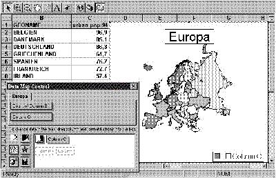
Fig. 2: Data Map Control window within Microsoft Excel
The starting point for drafting a map is a normal Excel sheet. The first column should contain the names or numbers of the spatial units to be depicted, for example the names of the countries. Naturally only those spatial units can be used for which Excel contains the respective coordinates. The standard equipment contains only few map data sets, including a world map and a map of Europe. In cases where other maps are needed, they have to be acquired from a specialized firm, and this could be rather costly.
The variables to be represented graphically in the map can be inserted into the columns adjacent to the geometrical names. The top row contains the name of the respective variable.
After that part of the sheet which is relevant for the map has been marked, the menu point INSERT-MAP must be selected. A cross-hair appears requesting the user to draw a frame for the map within the Excel table. Once this is completed, the screen display changes quickly. A complete map appears withing the frame of the map, including title and legend, and a window with the Data Map Control window opens up. Naturally the map is not yet ready for print, it still needs to be adjusted to the user's desires. Figure 2 shows the display as it appears at this stage. The Data Map Control window is displayed on the left lower side of the window.
At this point it is not immediately clear how to proceed. The Data Map Control window does not easily reveal how to alter the presentation and the arrangement of the variables. Even the programme's request "To change data in the map, drag column and format buttons in the box" is not very helpful, as the terms used, e.g. format buttons or column, are not clear.
It is only the integrated help function that provides an explanation. The term "column" refers to the white box within the Data Map Control window where the presentation and the content of the map are determined by assigning the variables to the forms of graphical representation. The following forms of graphical representation can be selected:
- Category Shading, i.e. choropleth maps;
- Value Shading, these are choropleth maps where each filled area represents one single value;
- Dot Density maps;
- Graduated Symbol, i.e. symbol maps;
- Pie Chart maps;
- Column Chart maps.
After the form of graphical representation has been selected, the next draft and the lay-out of the map can be worked on directly within the frame of the map via map menus. These appear by pointing on the objects and clicking the right mouse button. It now becomes evident that the programme limits the user's scope of action considerably. Class boundaries of choropleth maps, for example, cannot be defined by the user. The programme provides only two kinds of calculation possibilities. A similar problem exists with regard to colour series, where only the darkest colour can be selected. The rest of the colour series is created by the programme, with each colour series ending with white - a solution that is not very useful from the cartographer's point of view. Similar limitations also exist where other forms of graphical representation or the lay-out are concerned. The frames surrounding the legends and the title, for example, cannot be removed. The title frame can be avoided by leaving out the title altogether and by entering a free text instead (see fig. 3). Another possibility of adding text is the insertion of the data values or the area names into the map.
Two further interesting functions of the programme should be mentioned here. First, the map data sets provided do not only contain border lines, but also other geometric data, such as motorways, airports and cities. Second, Custom Pin Maps that can be placed over the completed map are another interesting feature of the programme. On Pin Maps, any one symbol can be positioned anywhere on the map. There are no restrictions as to how many Pin Maps can be defined and placed over each other.
Fig. 3: Two maps created with Microsoft Excel
Conclusion
At this point the existing version of the Data Map tool by Microsoft Excel is definitely inferior to the specialized Desktop Mapping programmes. Nevertheless, due to the fact that it is widely used, this tool will have a large number of users who will be able to produce rather useful provisional maps. The possibilities of producing ready-to-print and cartographically correct maps, however, are considerably limited unless the map is subsequently improved by using a graphic software such as CorelDraw.
Unfortunately, it is very likely that users who are not familiar with cartography will create maps with Excel that will not be very meaningful and might even be cartographically incorrect. Hopefully future versions of the programme will lead the user in a logically more consistent way on the "right" path. However, one cannot expect future versions to be more functional and to leave the user a greater scope of action regarding the lay-out. On the one hand, this would contradict the programme's philosophy; on the other, the developers of the programme will probably be interested in continuing to sell their specialized programme MapInfo, which is recommended in the Excel online help.
Further reading
Baloui, S. (1995): Excel für Windows 95. Haar bei München: Markt und Technik.
Bernhardsen, T. (1992): Geographic Information Systems. Arendal.
Monmonier, M. (1991): How to lie with maps. The University of Chicago Press.
Monmonier, M. (1993): Mapping it out: Expository cartography for the humanities and social sciences. The University of Chicago Press.
Olbrich, G.; Quick, M. & J. Schweikart (1996): Computerkartographie. Eine Einführung in das Desktop Mapping am PC. Berlin/Heidelberg: Springer.
Wood, D. & J. Fels (1993): The power of maps. London
Michael Quick is a geographer at the EURODATA Research Archive of the Mannheim Centre for European Social Research (MZES) and co-editor of this Newsletter.
Jürgen Schweikart, research fellow of the DFG, is currently working on a project about "Living conditions in European cities" at MZES / EURODATA in Mannheim.
EURODATA Newsletter No. 3 Article 8